The Concept
Toca is a 3D visualization studio in Brazil that turns architectural projects into visual experiences. Its work already had precision, sensitivity and a collaborative spirit. Its brand didn’t. Toca came to Serafina to rebrand and prepare for its next step: growing its digital presence and reaching clients abroad.
Before changing anything, we honored what the studio had already built. Then we looked at the market. Most visualization studios show architecture beautifully but stop there: the building is the hero, and the people who will live in it are an afterthought. That was the gap.
Toca became the narrator of future stories. It doesn’t just show how a space will look, but how it will feel: the moments, experiences and memories that will happen there. The brand sits between technique and sensitivity, between the precision of architecture and human emotion.
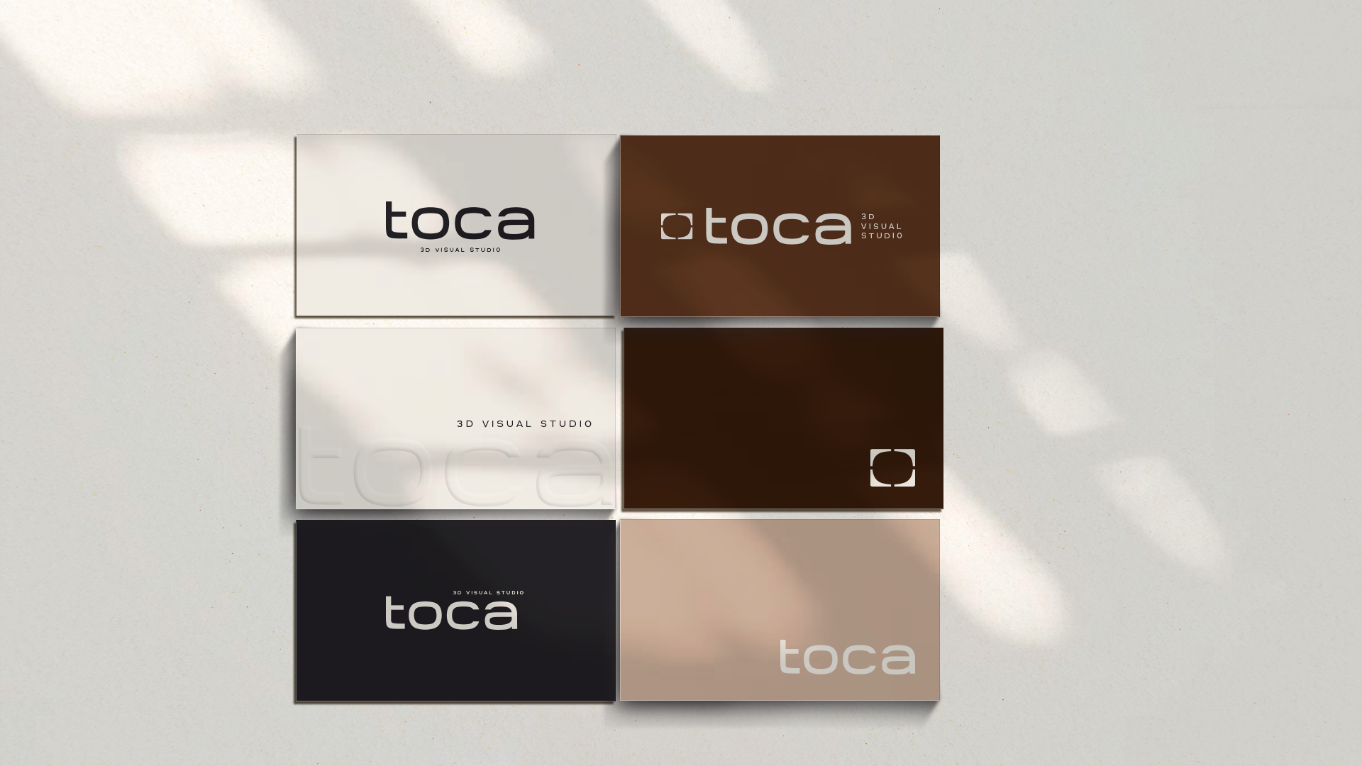
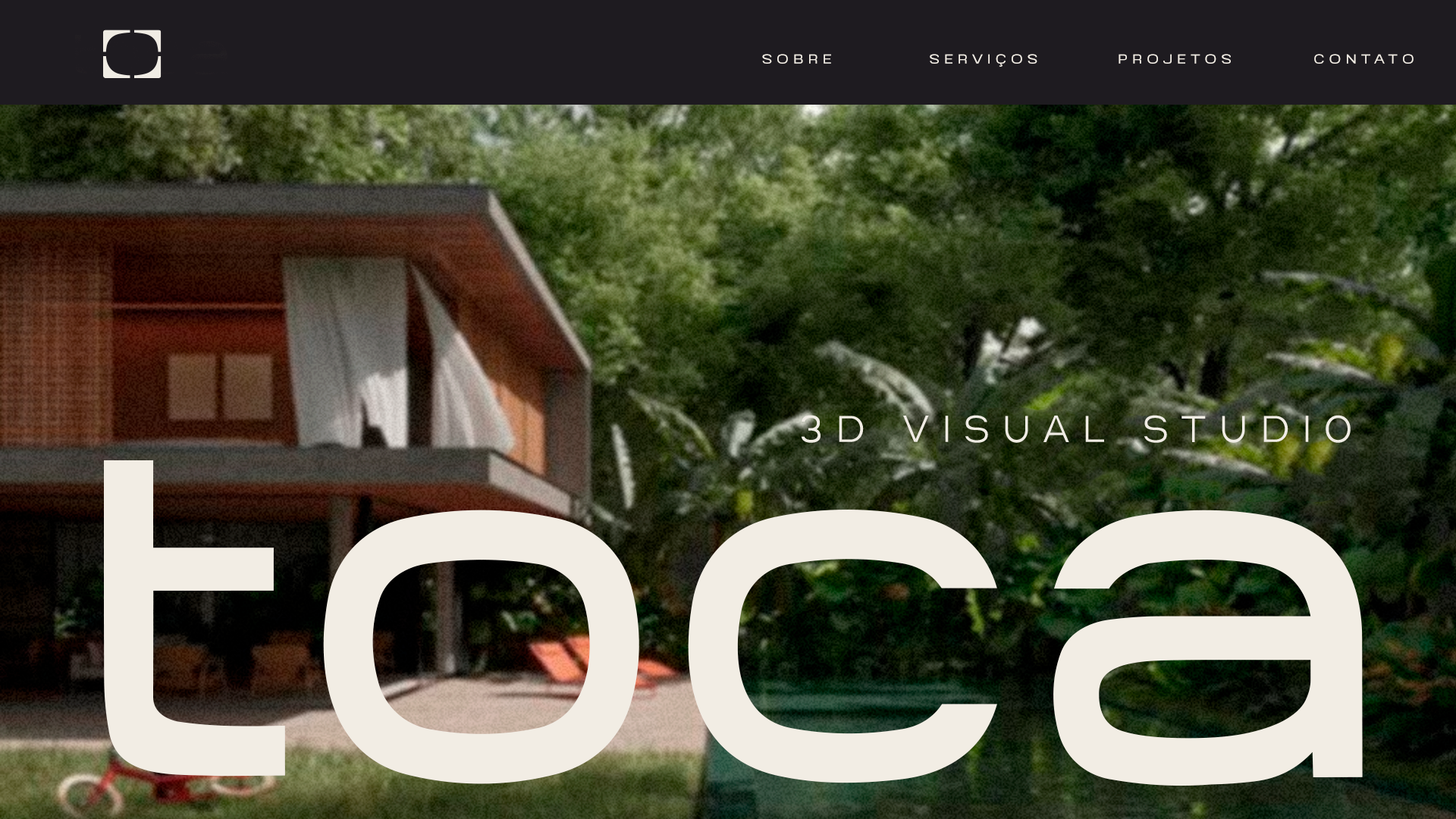
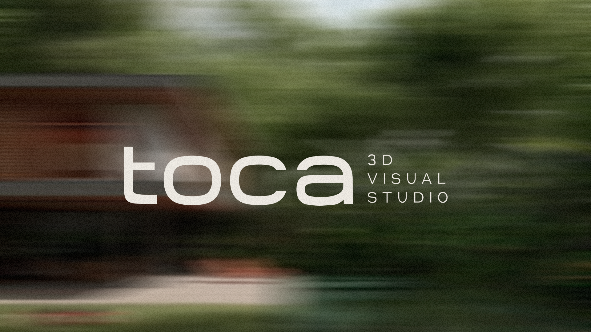
The identity follows that idea. The “O” in Toca became a screen, the visual field where every image is built. The square works as a frame, the line between what is still an intention and what can finally be seen. A target symbol adds focus, because Toca decides where to look. A refined palette of charcoal, ivory, coffee, sand and dusty teal keeps the logo in the spotlight, and the “3D Visual Studio” tag places the brand clearly in its market, in a language ready to travel.
The Result
A studio that now has a brand as precise and sensitive as the images it creates, ready to expand online and beyond Brazil.
A clear positioning that sets Toca apart from other visualization studios
A brand narrative built around people, not just buildings
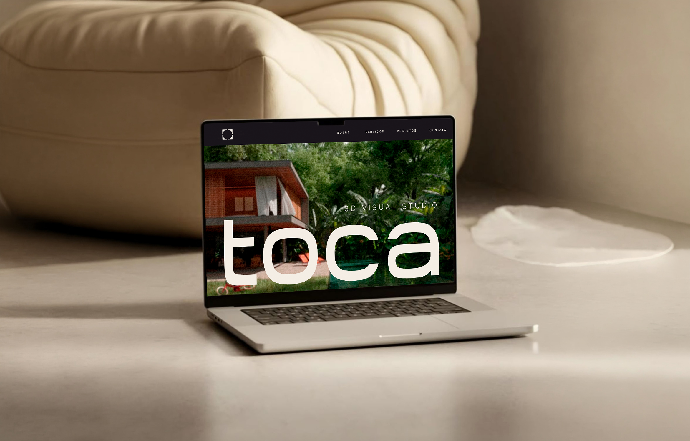
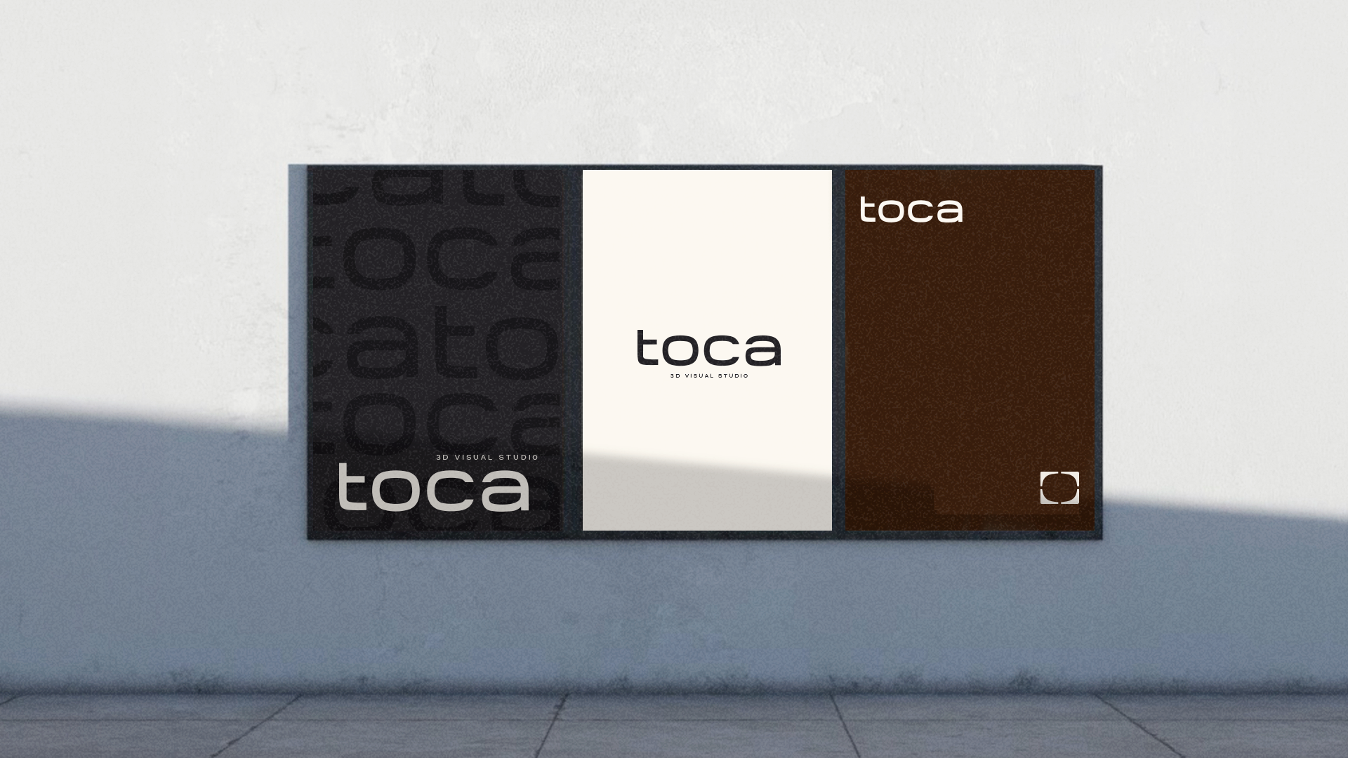
A complete visual identity designed for digital and international growth
Every space holds a story. Toca tells it first.
Serafina Marketing created the rebranding for Toca 3D Visual Studio, a Brazilian studio that turns architectural projects into visual experiences, covering brand strategy, brand narrative and a complete visual identity ready for digital and international growth.